Here is how Alex edited my Behind the Scenes footage:
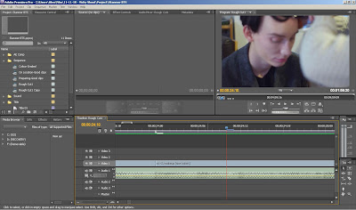
The film was shot on a Pentax KX DSLR, this meant that inter-changeable lenses could be used giving the much-important depth of field and with the prime lenses some nice bokeh could be had. It uses SD cards to store the files so logging of shots after the shoot was a simple and quick process of dragging-and-dropping from the SD card to the hard drive to preview and make notes (shown in the image below), and start editing straight away.
Vicky sent a list of some songs that she had listened to a lot throughout the project and that she feels were representative of her mindset. I chose Ladytron’s ‘Destroy Everything you Touch’ because of it’s high tempo, yet steady beat and build up for the introduction. The beat was the main part of the editing process as it was something that can be cut along to creating a coherent pace.
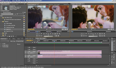
Adobe’s Premiere Pro was the chosen editing tool for its integration with Adobe After Effects where the film would be colour corrected, files can be linked and read by either programs with minimal hassle (the image below shows the imported After Effects file in Premiere Pro, the left hand window is before the colour grade, right hand side is after).
 The effect for the colour grade was to create a warm high contrast image to give the feel of a memory from childhood. I started by importing the Premiere Pro project where the data from the timeline is kept for individual shots, allowing me to colour grade each chosen shot independently.
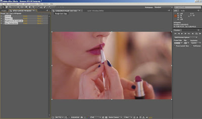
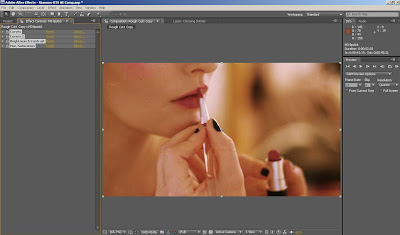
  Because of the mixture of light sources in some areas which cast different colour hues the first task was to correct this. For example; if make-up was being applied to a model near a window with a light on near by, the natural light would give a blue hue whereas the bulb would be orange. The general process was to increase the reds in certain places to create the warmth, and then to alter the blues and greens to increase their contrast in parts. For example; shots that took place in the woods would have the blue dramatically decreased and the green would be brought up along with the red to bring out the colour of leaves and surroundings. The two images below show this process.
  The effect worked particularly well on the close ups on the models where warm skin tones would be complimented by the make-up.
For the titles a handwritten style font was chosen like a personal letter to some effect, this was placed over a quick selection of clips converted into high contrast black and white. A pink/red hue was placed over the top of these and the wording coloured with darker hue to stand out. It was then exported in a youtube-friendly H.264 format, a high quality compression method largely used for web based videos.


No comments:
Post a Comment